We’re always admonished to “follow the science,” so let’s do so. Let’s start by looking at the CDC’s data as analyzed by a professor from Johns Hopkins University. (They have deleted the links to it, but, it has been archived elsewhere.)
(NOTE: Click any of the following graphs to see a larger version in a new tab.)
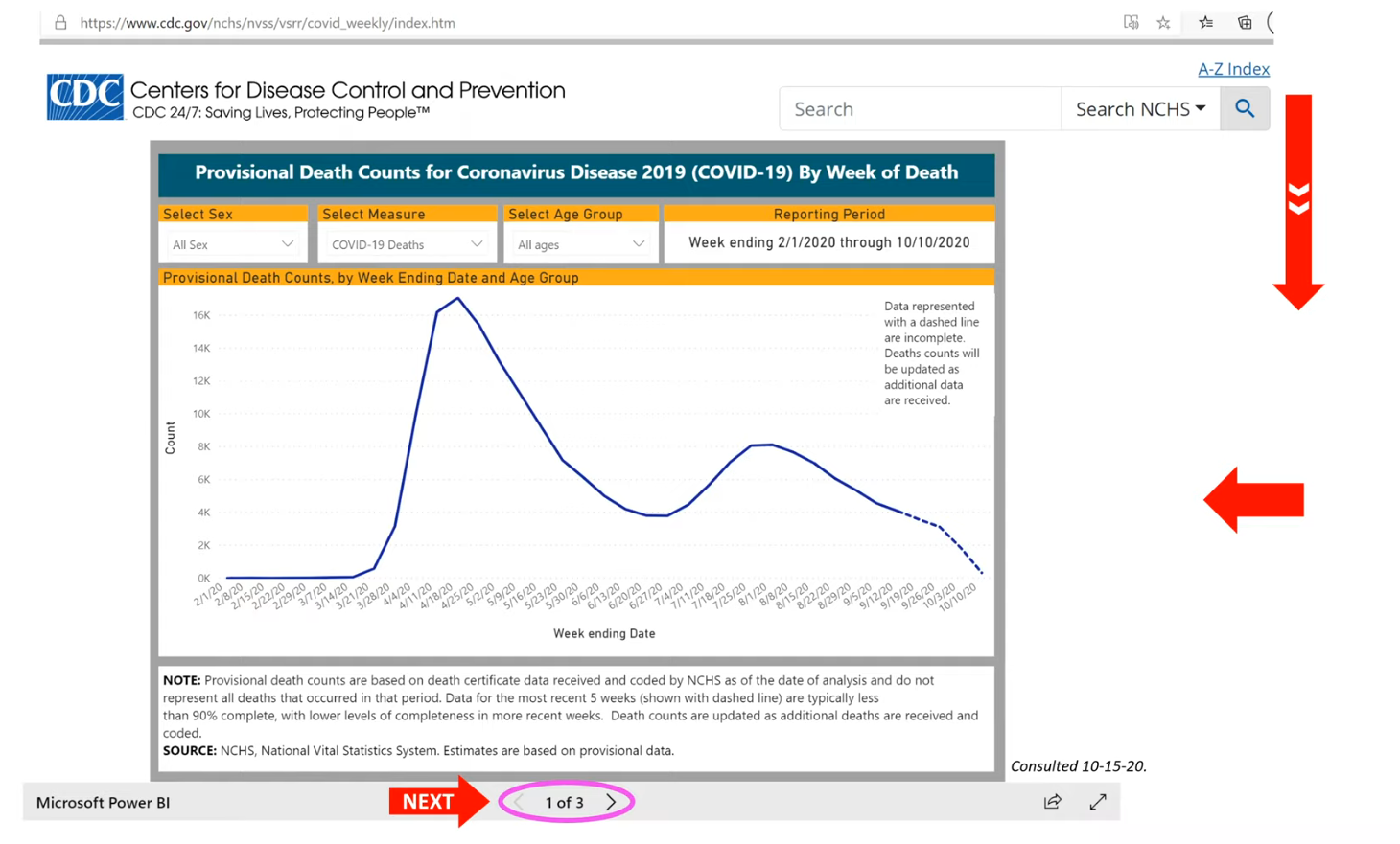
In the first graph, above, titled Provisional Death Counts for Coronavirus Disease 2019 by Week of Death we see a simple chart showing deaths attributed to Covid by week. There is a big peak in April followed by a decline, a small rise and further declines. One thing that seems obvious is that according to this graph the pandemic is over. But in the next few graphs you will see that the pandemic actually never was.
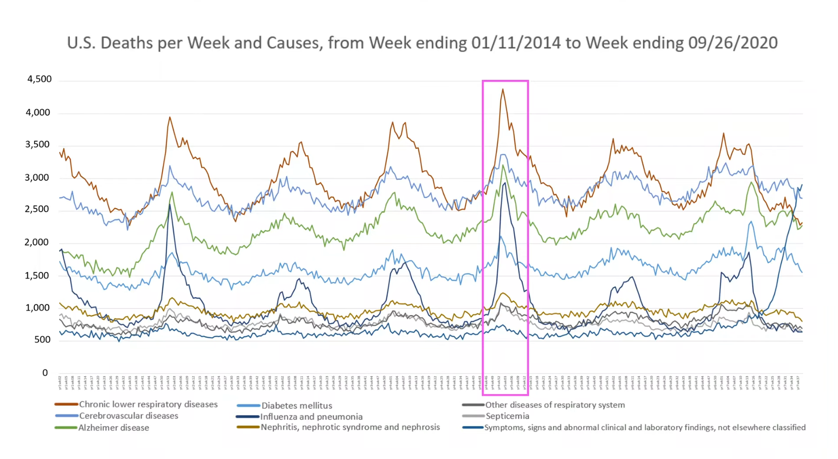
In the graph US Deaths per Week and Causes from Week ending 1/11/2014 to Week ending 9/26/2020 you will observe that every year there is a seasonal peak in deaths. What is very interesting is that these deaths are broken down into 9 causes of death, each one of which also has a peak. The pink box is centered around the year 2018 and it is clear that all the causes of death (not just influenza and pneumonia) go up, contributing to the total peak.
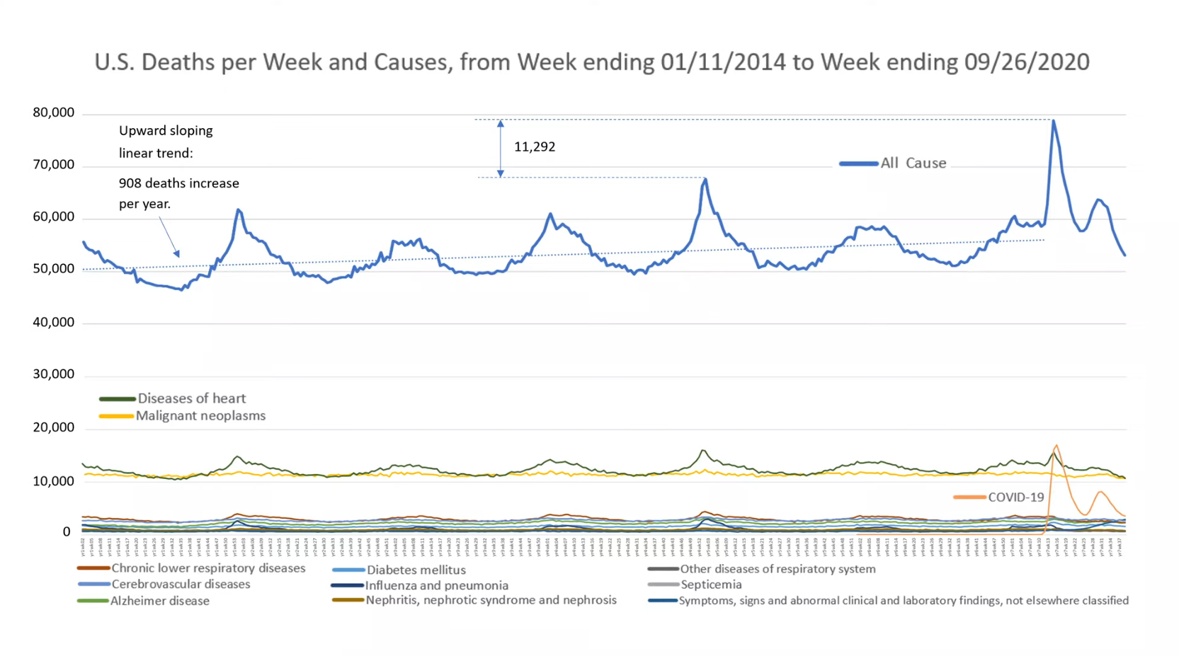
In the next graph, also called US Deaths per Week and Causes from Week ending 1/11/2014 to Week ending 9/26/2020 a line for total deaths has been added to the graph (so, the previous 9 causes of death are now down at the bottom because the y-axis has changed scale). Covid deaths have also been added. If you look closely you can see that the when Covid deaths peak the deaths from the other 9 causes decrease. In all previous years the deaths from theses causes have tracked with the total number of deaths but in 2020 they don’t. So, the Covid deaths are really just a re-branding of the other causes of death. (Another thing to notice is that in 2019 there were less total deaths than in 2018 setting up 2020 to be a year with a bit more deaths.) For a detailed analysis from the researcher watch this video.
Dr. Deborah Birx admitted early on that “I think in this country we have taken a very liberal approach to mortality.” Putting that comment into context: she was discussing the official guidance on filling out death certificates, which could be characterized as: when in doubt call it a Covid death. And that admission easily explains what is seen in these graphs.
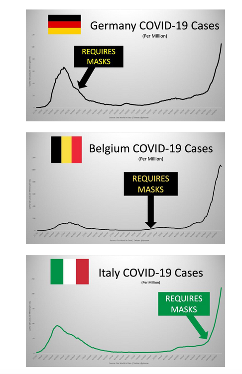
Since we are looking at data … what does the data say about the effectiveness of masks? In these three graphs we see the date of mask mandates in the country super-imposed upon a curve showing Covid cases by week. It’s clear that the number of cases have not been kept down by mask mandates. Instead, the number of cases goes up after mask mandates.
We have looked at the science by analyzing some graphs. now let’s look at the science via a court case in Portugal. German tourists were on holiday and tested positive and were forced to quarantine and were not allowed to return home. As a result, there was a trial and a decision in favor of the tourists that there was no reliable evidence that they were sick. The decision was upheld in an appeal. The court concluded:
“In view of current scientific evidence, this test shows itself to be unable to determine beyond reasonable doubt that such positivity corresponds, in fact, to the infection of a person by the SARS-CoV-2 virus.”
What has the data told us?:
- Covid deaths are just re-branded deaths that previously would have been designated influenza, pneumonia, kidney disease, etc.
- Covid cases go up after mask mandates are decreed.
- A “case” is defined as a positive PCR test which has been determined in a court of law not to be proof of infection with SARS-CoV-2 virus
In summary, the science tells us the pandemic never existed.
Sources:
Covid-19 Deaths: A Look at U.S. Data
Landmark Study Finds Masks Are Ineffective
English translation of Portuguese ruling
Related documents:
CDC Death Certificate Instructions
CDC Announces They Will Be Rolling Back Collection of Flu Data During the 2020-2021 Season